This is another in my series of blogs where I take a deep dive into converting a customized R graph into a SAS ODS Graphics graph. Can you guess what data I'll be using this time?
Here's a photo with a hint. This is Keeler, California (just west of Death Valley). The sign says population = 50. (Big thanks to my friend Eva, for coming up with this interesting picture!)

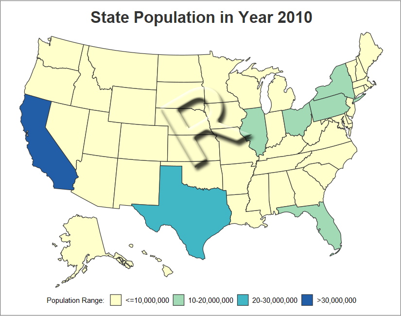
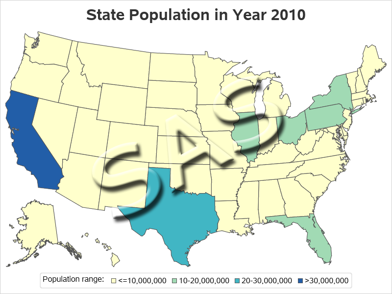
If you guessed "population data" you're right! In this example, I take state population data from the U.S. Census, group it into custom ranges, and then plot those ranges on a choropleth map using a color gradient. Below are my two comparable maps, created using R and SAS.
R map, created using plot_usmap()
SAS map, created using Proc SGmap
My Approach
I will be showing the R code (in blue) first, and then the equivalent SAS code (in red) I used to create both of the maps. Note that there are many different ways to accomplish the same things in both R and SAS - and keep in mind that the code I show here isn't the only (and probably not even the 'best') way to do things. If you know of a better/simpler way to do these things, feel free to share in the comments (note that I'm looking for better/easier-to-follow/best-practices that will help people new to the languages - not just different/shorter but more obscure code that might be difficult for newer programmers to follow!).
Also, I don't include every bit of code here in the blog (in particular, things I've already covered in my previous blog posts). I include links to the full R and SAS programs at the bottom, that you can download and run.
Getting The Data
The population data for this example comes from the U.S. Census. To make the example easy to distribute and run, I have included the data in the R program using the code below (note that the full data is in the sample program, linked at the bottom of the blog). The data values I used had commas as the thousands separators, and R read them in as character values by default. I added some code to get rid of the commas, and then convert the character variable to a numeric variable.
my_data<-read.table(header=TRUE,text="
state population_2010
AL 4,779,736
AK 710,231
AZ 6,392,017
[and so on...]
WV 1,852,994
WI 5,686,986
WY 563,626
")
my_data$population_2010 = as.numeric(gsub(",","",(gsub("\\.","",my_data$population_2010))))
In SAS, we include the Census state totals in our sample data, therefore I just grabbed a copy of that for my SAS version of the map.
data state_data; set sashelp.us_data (keep = statecode population_2010);
run;
Population Ranges
Both R and SAS could plot the data on a map, and automatically split the data into default ranges (also known as buckets) ... but I wanted to use my own ranges. Therefore I determine which range each state's population is in, and assign a population_bucket. In the R code below, I use nested ifelse functions.
my_data <- my_data %>% mutate(
my_data, population_bucket=
ifelse(population_2010<=10000000,"1",
ifelse(population_2010<=20000000,"2",
ifelse(population_2010<=30000000,"3","4"))))
In SAS, I use if/else statements in a data step:
data state_data; set sashelp.us_data (keep = statecode population_2010);
if population_2010<=10000000 then population_bucket=1;
else if population_2010<=20000000 then population_bucket=2;
else if population_2010<=30000000 then population_bucket=3;
else population_bucket=4;
run;
Drawing the Map
When plotting data on a U.S. map, we (in the U.S.) often like to move and resize Alaska and Hawaii so they fit under the bottom/left corner of the map (rather than leaving them in their proper geospatial position and sizes). Therefore, someone has created a special R function to plot US maps in that way. The plot_usmap() function expects the state abbreviation (or name) to be in a variable called state, so I had to take that into consideration when creating my dataset (I would normally call the variable statecode). The color= specifies the outline/border color of the states.
my_plot <- plot_usmap(
data=my_data,regions="state",values="population_bucket",
labels=FALSE,color="#333333")
In SAS, I use Proc SGmap, to plot the data ... but I need some map borders to plot the data/colors in. The easiest way to obtain map borders that are ready to use in SAS, is to buy a SAS/Graph license, and use the maps found in the mapsgfk library. For example, it contains the special mapsgfk.us map which has Alaska and Hawaii in the bottom/left, as we want for this example. Alternatively, you could use Proc Mapimport to import a Shapefile for the map you want to use.
proc sgmap maprespdata=state_data mapdata=mapsgfk.us;
choromap population_bucket / discrete mapid=statecode
lineattrs=(thickness=1 color=cx555555);
run;
Legend Layout
In R, I use the theme settings to place the legend at the bottom/center of the graph, and then adjust some numeric parameters to move the legend closer to the graph (I had to play around with these numbers quite a bit, to get the legend placement exactly like I wanted). I also use the theme to add a legend title, and control the size of the legend text and title.
theme(legend.position="bottom",legend.justification="center",
legend.margin=margin(0,0,0,0),legend.box.margin=margin(-20,0,0,0)) +
guides(fill=guide_legend(title="Population Range: ")) +
theme(legend.text=element_text(size=11)) +
theme(legend.title=element_text(size=11)) +
In SAS, the legend is in the bottom/center by default, and positioned close to the map (so no need to fiddle with it). The label of the variable is the default title of the legend, therefore I assigned the desired title using a label statement when I created the dataset. I control the size of the title and text values using the keylegend statement.
label population_bucket='Population range:';
keylegend / titleattrs=(size=12pt) valueattrs=(size=12pt);
Legend Colors and Values
Rather than taking the default colors, I want to specify custom colors. In R, I use the scale_fill_manual() function, where I can specify the colors and the text values to use for the population_bucket values. I used rgb colors from a 4-color, multi-hue, colorblind safe gradient I found on colorbrewer2.org. Although I'm technically plotting the population_buckets (1-4), I don't want the bucket values to be shown in the legend - I want to show my custom range of population values instead, therefore I hard code them as the value labels.
scale_fill_manual(name="population_bucket",
values=c(
'1'="#ffffcc",
'2'="#a1dab4",
'3'="#41b6c4",
'4'="#225ea8"),
labels=c(
'<=10,000,000',
'10-20,000,000',
'20-30,000,000',
'>30,000,000'),
na.translate=FALSE)
In SAS, I create a user-defined-format to associate the desired text values with the numeric bins (1-4). I then apply that format to the variable in the dataset using a format statement. I specify my custom colors using a styleattrs statement. I show the commands 'out of context' below (see the full code, linked at the bottom of the blog, to see exactly where these statements go in the code).
proc format;
value popfmt
1 = "<=10,000,000"
2 = "10-20,000,000"
3 = "20-30,000,000"
4 = ">30,000,000"
;
run;
format population_bucket popfmt.;
styleattrs datacolors=(cxffffcc cxa1dab4 cx41b6c4 cx225ea8);
My Code
Here is a link to my complete R program that produced the map.
Here is a link to my complete SAS program that produced the map.
If you have any comments, suggestions, corrections, or observations - I'd be happy to hear them in the comments section!

3 Comments
Hello! This graph tutorial is absolutely fantastic. You helped me to do in R what I've spent all day trying to figure out. I'm not sure if this is the appropriate space in which to ask questions, but I'm wondering if there's any way to also layer the state abbreviation labels onto this graph that you made in R? When I tried changing the "labels" argument to TRUE the code didn't work, and I haven't found any other way to do this. Thank you so much!
I'm no R expert, but I'll leave your question here in case an R expert comes along and can help answer your question. On the other hand ... if you decide to go with a SAS map, I could definitely help you out with that! 🙂
Thank you! I appreciate that!